4 Paint Colors to Avoid Using In the Bedroom
Trending colors can provide great inspiration for updating your home, but not all colors are equally suited for every space. Understanding the psychology of colors and how they reflect mood and behavior is important — especially for places such as bedrooms, which should be designed specifically for rest and relaxation to help you recharge.
Before putting brushes on a wall, here are some colors you may want to rethink before using them in your bedrooms:
Yellow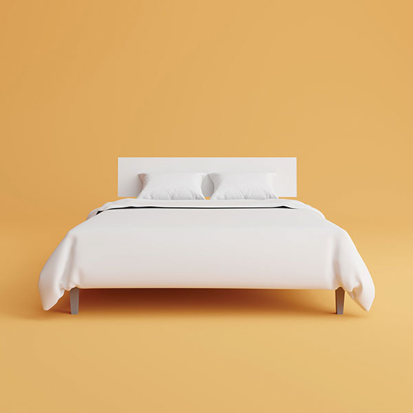
Sunny yellow — the symbol of happiness — may seem like a natural fit for a bedroom. However, it stimulates the senses as the most attention-getting color in the spectrum. This can be a plus when you need a morning boost but disruptive when you’re trying to unwind in the evening. If yellow is a must-have color for you, avoid using it on walls that overlook the bed while lying down, and opt for lighter tones to reduce its stimulative effect.
 Red
Red
Like yellow, red is also a stimulator and can evoke wildly mixed emotions. On the one hand, it can induce a feeling of warmth — a cozy thought for a bedroom. But, as a color more commonly associated with danger and aggression, it can also create a feeling of agitation after prolonged exposure. Stylish and bold? Yes. Calm and relaxing? Likely not.
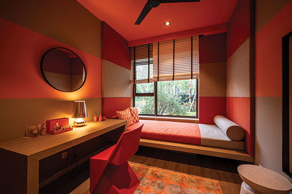
Orange 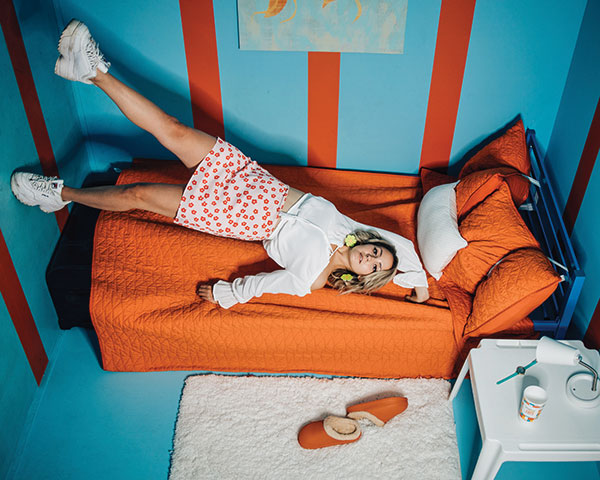
A warm color that boosts energy, orange is an optimal choice for playrooms or exercise areas and is often used in advertising to excite and grab attention. However, in spaces that are designed for relaxation, it’s best to skip more vibrant hues of orange and opt instead for pastel peaches and apricots for a warm glow without the high-energy vibes.
Dark Brown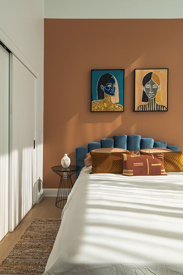
Dark colors, in general, are tricky because they can seem gloomy and visually shrink spaces. Brown presents a particular challenge in that, although it’s a great nature-inspired neutral, it is also associated with isolation and loneliness. To avoid creating a dull and heavy space, contrast it with other lighter elements to provide balance.
Bonus tip: Neon colors in any hue are generally better options for other applications, as they are often associated with warning and danger and can be irritating to the eyes — emotional and physiological reactions that are not conducive to sleep or relaxation.
Ultimately, color selection is a personal and subjective decision, and many designers can successfully introduce a so-called “changeling color” and make it work in any space. If yellow, red, orange, dark brown or neon is too good to give up, use it on a wall that won’t be in sight when trying to unwind (e.g., a wall behind the bed), or select a lighter or muted hue that may not evoke unwelcomed emotions.
For more design tips, contact the Central Washington Home Builders Association or visit cwhba.org
![]()
CENTRAL
WASHINGTON
HOME
BUILDERS
ASSOCIATION
CWHBA
509-454-4006
www.CWHBA.org
25 N. Wenatchee Ave., Suite 207-B
Wenatchee, WA
© Copyright 2025 | All rights reserved | Privacy Policy
"We do not share any client data with third parties. Your personal information is kept confidential and is not disclosed to any outside organizations except as required by law or with your explicit consent."

